CASE STUDY・2025
Globospect: where do news stand politically?
GloboSpect is a news platform redesigned around a single insight from my research: readers want to know where their news stands politically — centrist, left-leaning, or right-leaning — before they commit to reading it. The product delivers that transparency inside a clean, responsive interface designed for mobile, tablet, and desktop.
ROLE
Product & Brand Designer
TIMELINE
Dec 2025 • 4 weeks
TYPE
Concept project
DELIVERABLES
Brand, UI system, Prototypes
THE PROBLEM
news is louder than ever, and trust is at an all-time low.
Readers are flooded with headlines designed to provoke, not to inform. They don't know who wrote a story, where it sits on the political spectrum, or whether to believe it. The result is fatigue, avoidance, and a quiet erosion of shared reality.
LOGO
The logo uses overlapping circles to evoke the ideological spectrum that runs through every news story. Colors shift and blur, never fully aligning, just as political layers never quite resolve into a single truth. Designed in Figma, finalized in Canva.
Process
Six weeks, structured around evidence — not opinion.
01 Benchmarking
Audited UOL, G1, RTP and Ground News against Nielsen's 10 usability heuristics to find recurring friction.
04 response
A calm, slow-news interface. Every article carries a transparent left / center / right bias tag.
02 User research
Interviewed and tested with readers across the political spectrum to understand trust, fatigue and bias awareness.
05 System
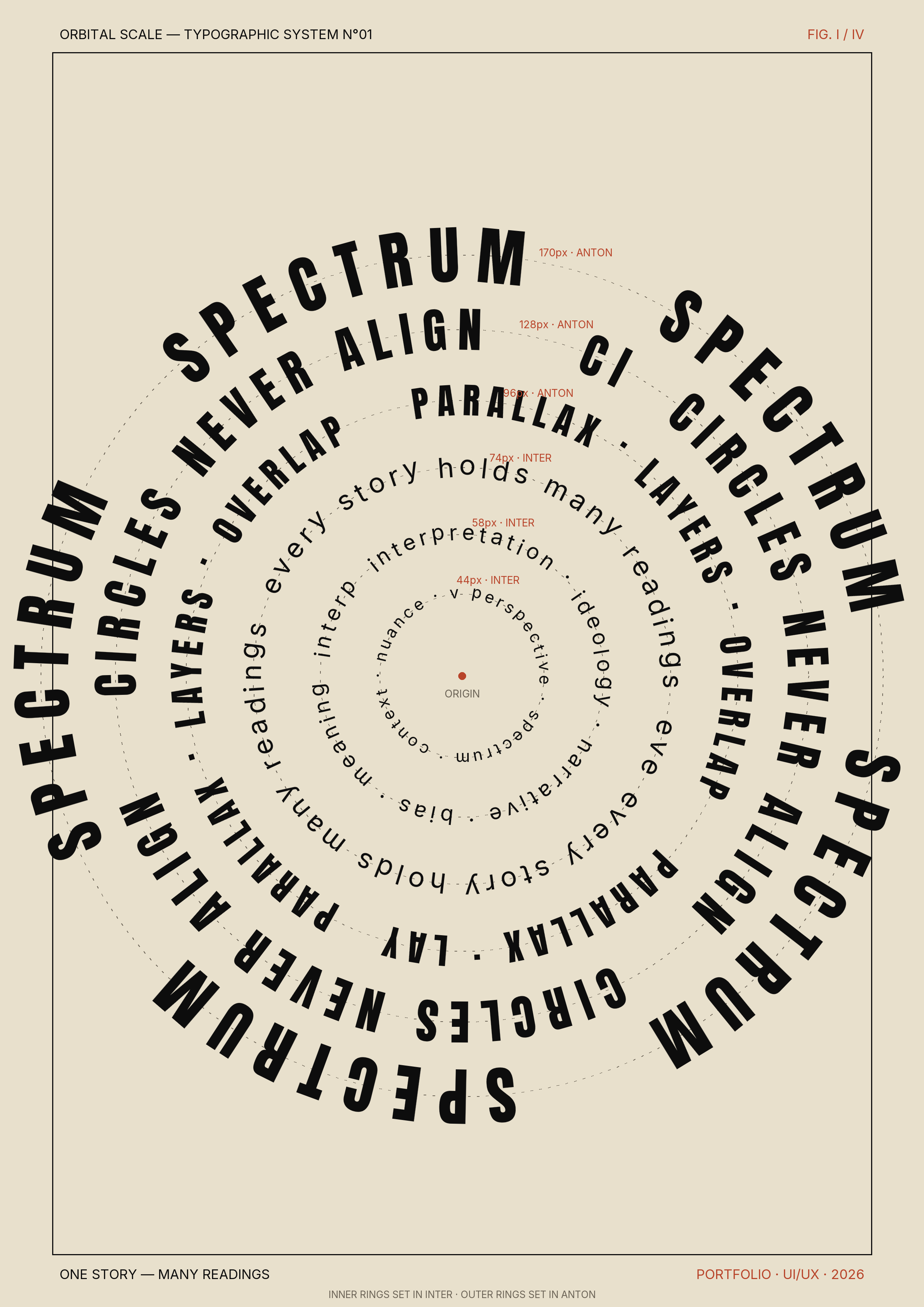
Type scale, color, iconography and motion built around legibility — Anton for headlines, Inter for body.
03 Findings
Readers wanted context, not louder headlines. A visible bias label reduced anxiety and improved confidence in the source.
06 Prototypes
Low-fi flows validated with users, then refined into a high-fidelity responsive prototype.
RESEARCH
What readers actually said.
“I don't trust any single outlet anymore — but I don't have time to read five of them either.”
- Participant 03, 45, police“If I knew where a story was leaning, I'd probably read more of them, not fewer.”
- Participant 07, 72, architect4
COMPETITORS AUDITED
12
INTERVIEWS
9/10
WANTED BIAS LABELING
THE SYSTEM
built around legibility.
Anton
Display — confident, news-room weight.
Inter
Body — neutral, calm, screen-first.
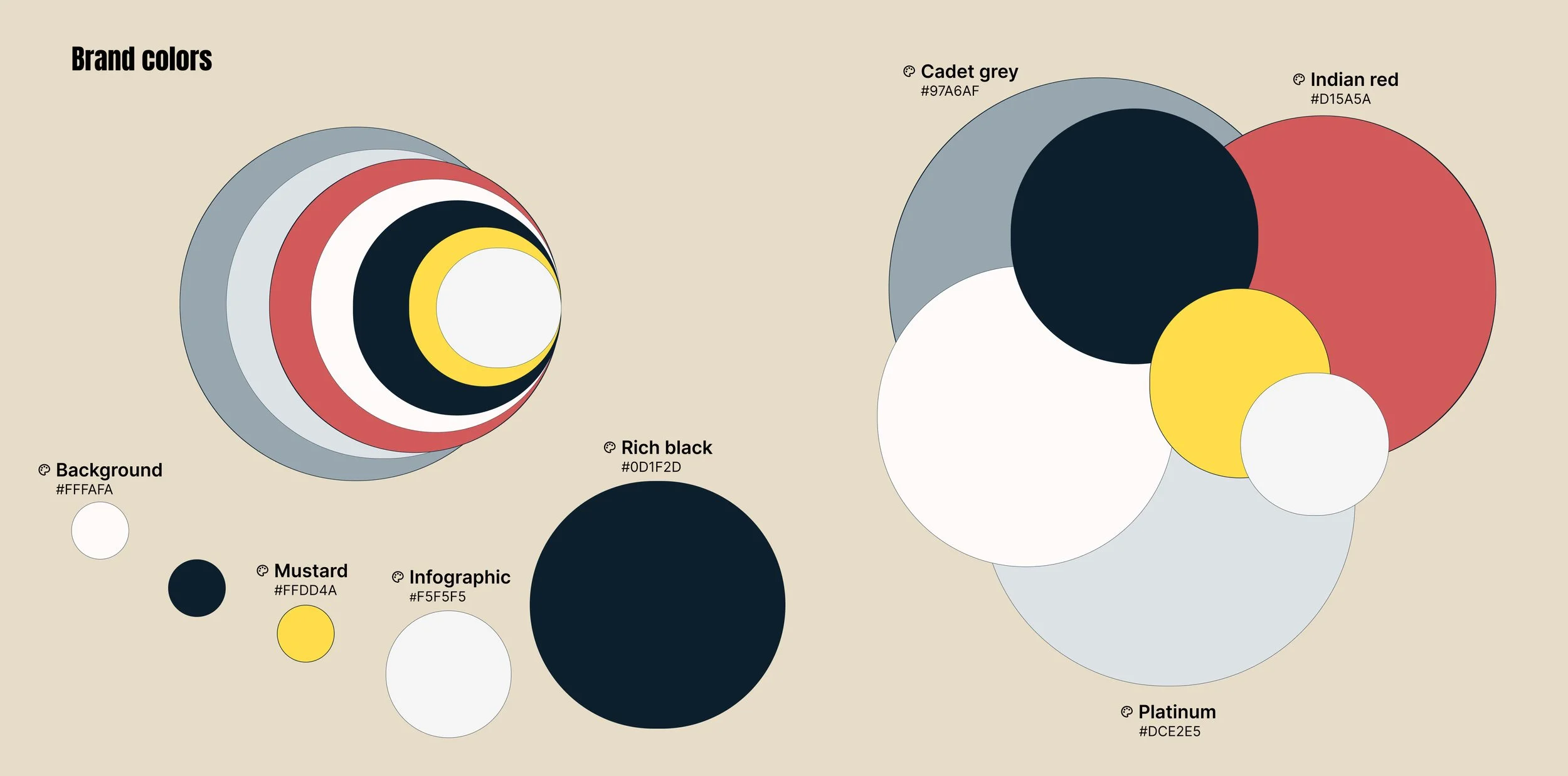
COLOR
A near-monochrome palette keeps stories quiet. Three semantic accents do one job: locate a source on the spectrum.
BIAS LABEL • IN CONTEXT

PROTOTYPE
Calm by default.
transparent on demand.
The feed reads like a slow newspaper. Tap any source label to expand a transparency card: who owns it, where it sits on the spectrum, and how often it's been independently fact-checked.

REFLECTION
Designing for trust isn't about adding more — it's about showing your work.
Globospect taught me that the smallest interface element — a label, a dot of color — can carry the most weight. The next step is testing the bias-labeling model with editors and exploring an accessible version of the color system for color-blind readers.