CASE STUDY • RESEARCH & STRATEGY DOCUMENTATION
HOW GLOBOSPECT WAS BUILT
GloboSpect was not designed around assumptions. The project combined competitive benchmarking, usability evaluation, user research, strategic product thinking, and iterative design to explore how transparency can rebuild trust in digital news experiences.
ROLE
UX/UI Designer
YEAR
2025
SCOPE
Research → Prototype
METHOD
Nielsen's 10 Heuristics
PROJECT METHOD
Trust was treated as a system, not a slogan.
Each phase connected evidence to decisions: what readers said, where existing platforms created friction, how the product could support growth, and how the interface could make political context visible without adding more noise.BENCHMARKING
01
01 UOL
How do current news platforms handle trust, orientation, and transparency?
I audited UOL, G1, RTP, and Ground News using Nielsen's 10 Usability Heuristics to understand how major news platforms help readers locate themselves, recover from errors, evaluate credibility, and navigate dense information environments.
02 g1
POSITIONING
Brazilian news platform perceived as right-leaning.
KEY ISSUES IDENTIFIED
During login and registration, users could not easily return after giving up or encountering an error. The site also offered limited contextual information about the company and its editorial structure.
HEURISTICS AFFECTED
Visibility of system status
User control and freedom
Help and documentation
UX IMPACT
High severity. Users may feel trapped in the flow and abandon the experience.
DESIGN OPPORTUNITY
GloboSpect should provide clear navigation recovery, visible support paths, and transparent contextual information.
03 rtp
POSITIONING
Portuguese news platform perceived as politically balanced.
KEY ISSUES IDENTIFIED
Few significant usability issues were identified. The platform presented clearer navigation and a more structured information experience compared to the other audited websites.
HEURISTICS AFFECTED
No major violations observed.
UX IMPACT
Low severity. RTP worked as a useful reference for clarity and editorial structure.
DESIGN OPPORTUNITY
GloboSpect should preserve clarity while adding a more explicit political-bias transparency layer.
04 ground news
POSITIONING
News platform focused on political bias comparison and media transparency.
KEY ISSUES IDENTIFIED
Ground News validated the relevance of political-bias transparency as a product feature, but also showed that this information needs to be presented without overwhelming the reader.
HEURISTICS AFFECTED
Recognition rather than recall
Aesthetic and minimalist design
UX IMPACT
Medium severity. Transparency is valuable, but it must remain easy to scan and understand.
DESIGN OPPORTUNITY
GloboSpect should make bias labeling visible, simple, and contextual — not hidden behind complex explanations.
POSITIONING
Brazilian news platform perceived as politically balanced.
KEY ISSUES IDENTIFIED
Readers could not easily understand where they were within the website. Login and registration flows lacked clear recovery paths, and large volumes of text and images made content prioritization difficult.
HEURISTICS AFFECTED
Visibility of system status
Aesthetic and minimalist design
UX IMPACT
Medium severity. Navigation was not blocked, but cognitive load increased.
DESIGN OPPORTUNITY
GloboSpect should make location, category, and reading priority visible at all times.
USER RESEARCH
02
Interviews
12
INSIGHT 01
“I don't trust any single outlet anymore.”
Readers wanted transparency, not neutrality.
What readers actually said.
To validate the findings from the benchmark, I conducted interviews with readers across different political positions.
Age range
24-72
INSIGHT 02
“If I knew where a story stood politically, I'd probably read more of them.”
Political labeling reduced anxiety rather than increasing polarization.
Research outcome
“11/12 wanted a visible political-position label.”
Participants asked for political context attached directly to news stories.
Perspectives
Multiple
INSIGHT 03
“I don't have time to compare five different newspapers.”
Users needed shortcuts to credibility.
Research signal
“The right cue before opening.”
Readers were not asking for more information everywhere — they wanted the right trust cue before deciding what to read.
STRATEGIC THINKING
03
DESIGN RESPONSE
RESEARCH FINDING
PRODUCT HYPOTHESIS
The project explored how trust, transparency, and personalization could support both user goals and product growth.EXPECTED PRODUCT IMPACT
Bias-aware onboarding
Connecting user needs to business outcomes.
Consistent calls-to-action
Many users abandoned news websites before consuming meaningful content.
If readers receive personalized recommendations and clear political context, they will reach value faster and engage more deeply.
| Faster time-to-first-value
| Higher retention
Personalized feed
| Increased activation
| Improved trial-to-paid conversion
Clear article hierarchy
Transparent source labeling
INFORMATION ARCHITECTURE
04
PRIMARY NAVIGATION
01
02
03
04
05
06
07
08
HOME
FOR YOU
POLITICS
ECONOMY
TECHNOLOGY
ENTERTEINMENT
HEALTH
EDUCATION
SECOND LAYER
01
02
03
04
05
Designing clarity before designing screens.
One of the main goals of GloboSpect was reducing cognitive overload.
SAVED ARTICLES
READING HISTORY
ACCOUNT
SUBSCRIPTION
SUPPORT
GUIDING PRINCIPLE
Every screen should answer: Where am I? What should I do next? Why is this content relevant to me?
WIREFRAMES & ITERATION
05
01
02
STAGE
INITIAL CONCEPT
STAGE
user feedback
From assumptions to evidence.
Low-fidelity wireframes were used to test article prioritization, onboarding flows, source-label visibility, and CTA hierarchy.
Political information hidden inside article pages.
Participants wanted context before opening an article.
03
STAGE
final decision
Political-position labels became visible directly in article cards.
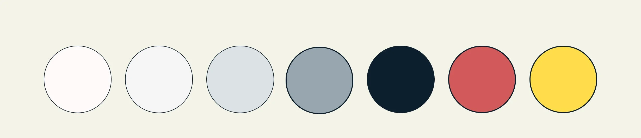
DESIGN SYSTEM
06
Anton
Used for headlines and editorial emphasis.

Built around legibility.
The visual system was designed to feel calmer than traditional news websites.
Inter
Used for body content and interface elements.
Color system
A restrained palette minimizes visual noise while allowing political-position indicators to remain immediately recognizable.
Explore the complete case study
Ao clicar:
Benchmarking
Nielsen Heuristics
Research Plan
Interview Questions
Affinity Mapping
Key Insights
Information Architecture
Sitemap
Low-Fi Wireframes
Usability Testing
Iterations
High-Fidelity Prototype
Antes de começar o segundo case:
Adicionar benchmarking visual.
Adicionar síntese da pesquisa.
Mostrar um sitemap.
Mostrar wireframes.
Mostrar pelo menos uma iteração baseada em feedback.
Explicar melhor como as entrevistas levaram ao sistema de rotulagem política.