Globospect
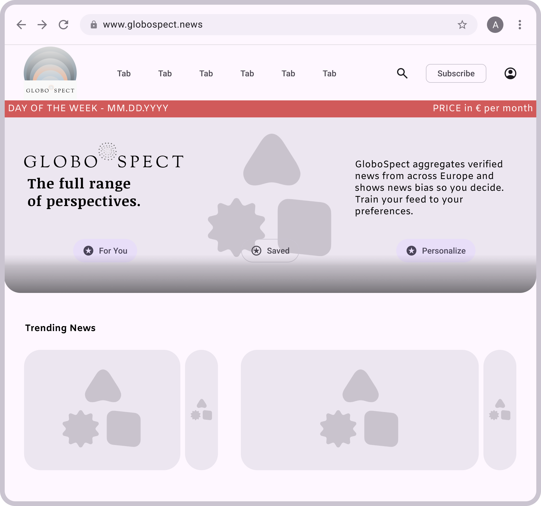
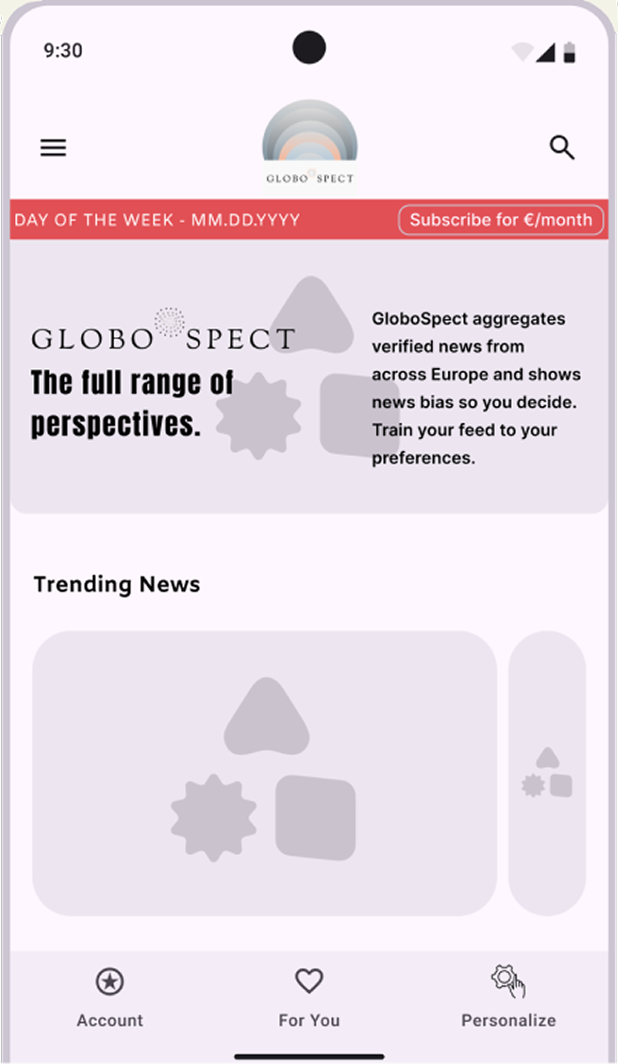
GloboSpect is a news platform redesigned around a single insight from my research: readers want to know where their news stands politically — centrist, left-leaning, or right-leaning — before they commit to reading it. The product delivers that transparency inside a clean, responsive interface designed for mobile, tablet, and desktop.

Logo
The logo uses overlapping circles to evoke the ideological spectrum that runs through every news story. Colors shift and blur, never fully aligning, just as political layers never quite resolve into a single truth. Designed in Figma, finalized in Canva.
Benchmarking
〰️
User research
〰️
Behavior design
〰️
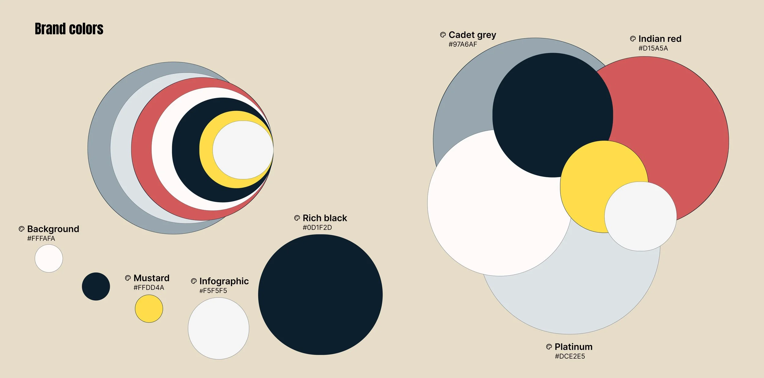
Colors
〰️
Typefaces
〰️
Icons
〰️
Benchmarking 〰️ User research 〰️ Behavior design 〰️ Colors 〰️ Typefaces 〰️ Icons 〰️
Research & Benchmarking
The redesign started with a benchmarking analysis of four competitors — UOL and G1 (Brazil), RTP Notícias (Portugal), and Ground News (Canada) — audited against Nielsen's 10 Usability Heuristics to map where each one fell short.
From there, I formed hypotheses about how users might react to those friction points — abandoning navigation mid-task, giving up on an article, or hesitating over which button to click. To validate these assumptions, I then ran a usability test with real users to validate which friction points mattered most in practice: participants were asked to complete some tasks on the live site while I observed their behaviour and documented usability issues as they emerged across the flow.
“I didn’t know what some buttons meant or where I should click to leave the subscription page.”
Key Findings
Across both the benchmark and the user test, the same pain points surfaced again and again:
Color combinations that failed accessibility contrast standards
No clear signal of a story's political positioning
Cluttered layouts that buried the actual news
Multiple buttons performing nearly identical functions
Inconsistent iconography and unclear button affordances
Weak visual hierarchy — users couldn't tell what to read or click first
Difficulty finding support or contact channels
Design Response
GloboSpect was conceived to address these issues directly. Each article is tagged with its political bias, so readers can choose content aligned with their preferences — or deliberately step outside them. The interface is calm and uncluttered, with modern typefaces that feel contemporary without losing a professional tone, and a colour palette that stays distinctive without feeling flat.
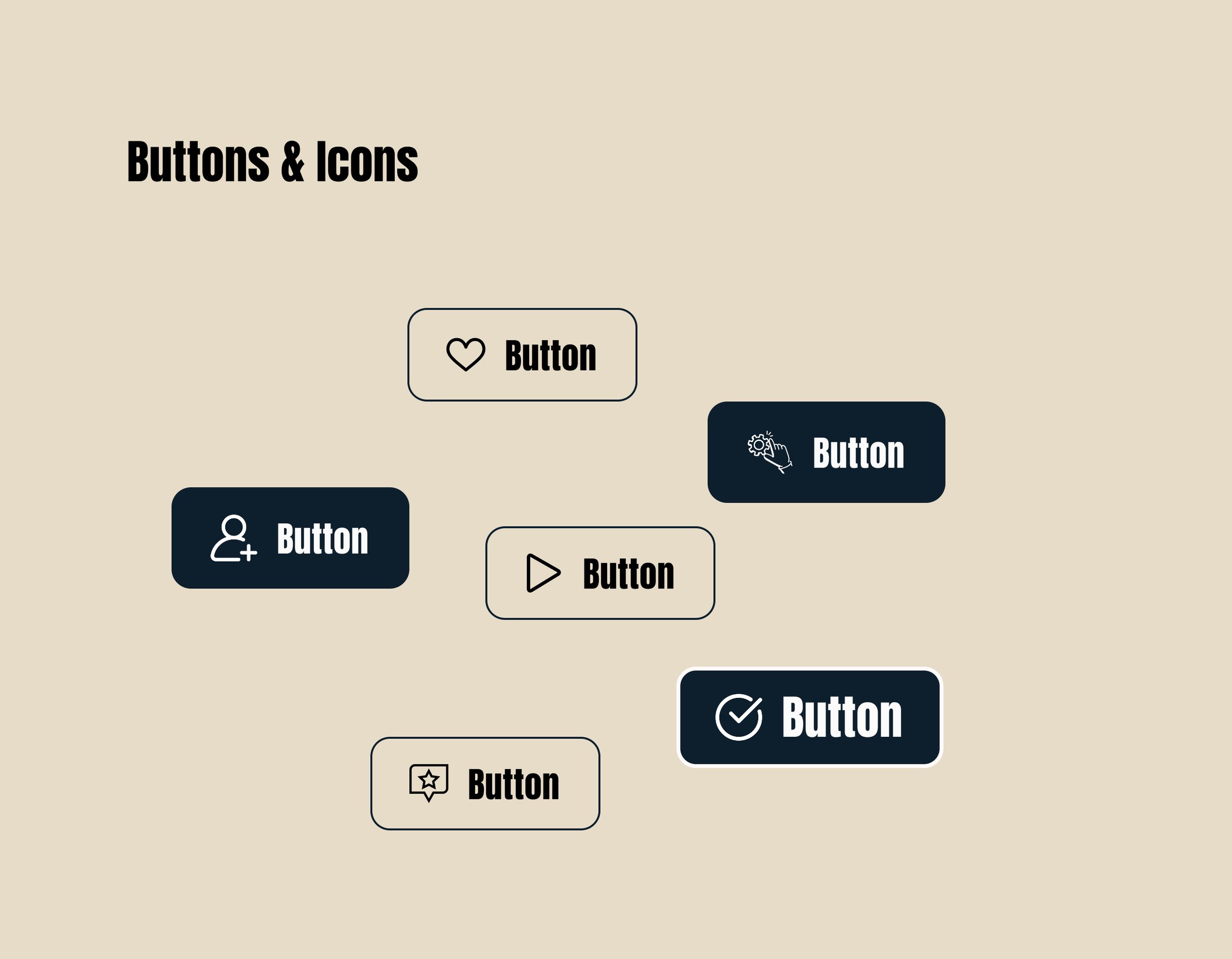
Standardised icons create consistency across the platform, and a clear visual hierarchy guides the eye to what matters first. Personalisation tools and saved items are surfaced with simple, in-context guidance, so users always know how to tailor the experience. Subtle animations — dissolve, move-in, and overlay — add dynamism and create a smoother, more engaging experience.

Typefaces
Anton was selected for headlines to create strong visual impact, while Inter was used for body text, secondary headings, and subtitles to ensure readability.
The elements below offer an overview of GloboSpect's refreshed visual.
High fidelity wireframes & prototypes
The differences between the low-fidelity wireframe and the final prototype reflect visual and interface refinements introduced during the design iteration process, rather than a structural redesign of the website resulting from the research phase.
Mobile

Tablet
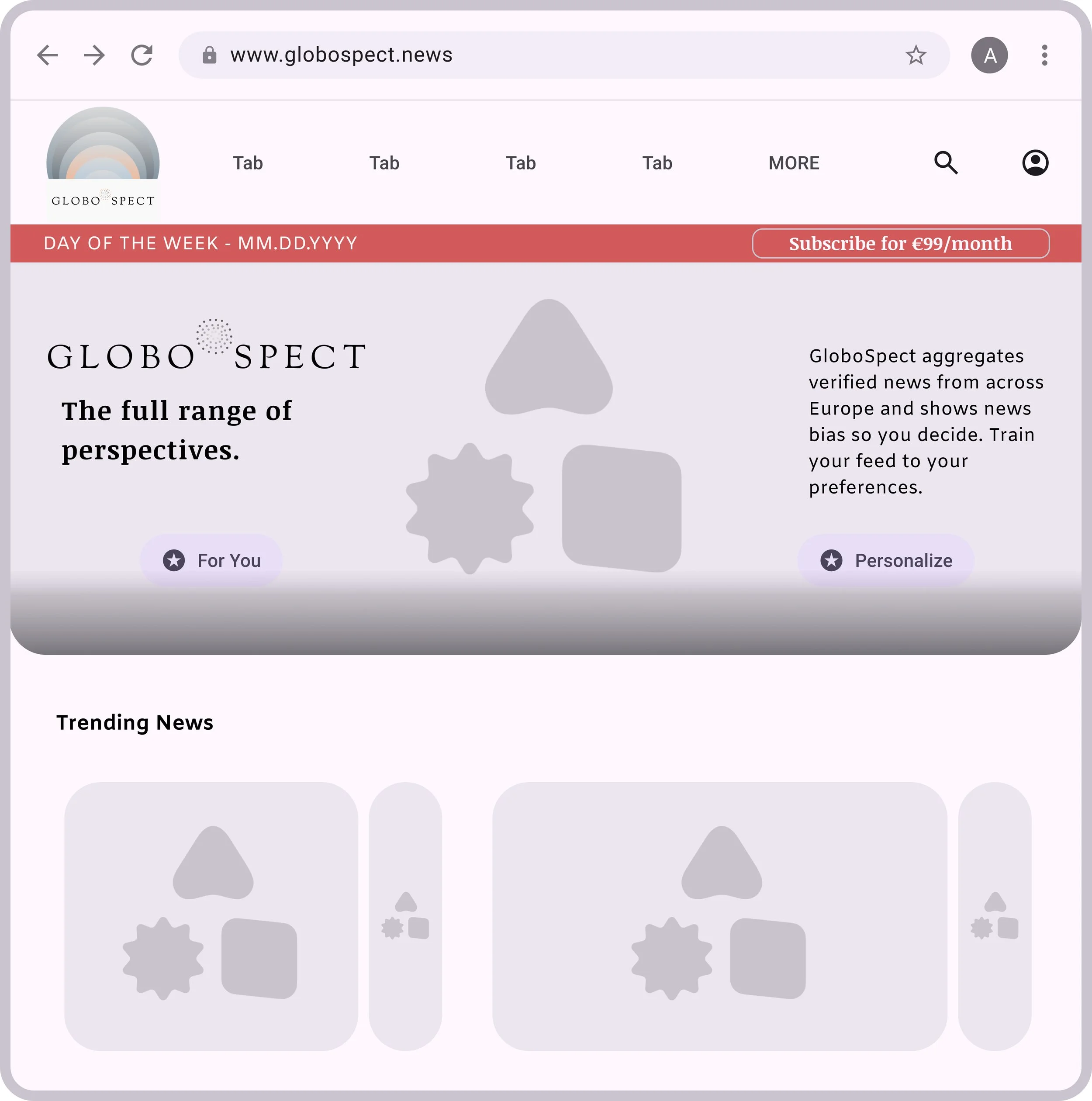
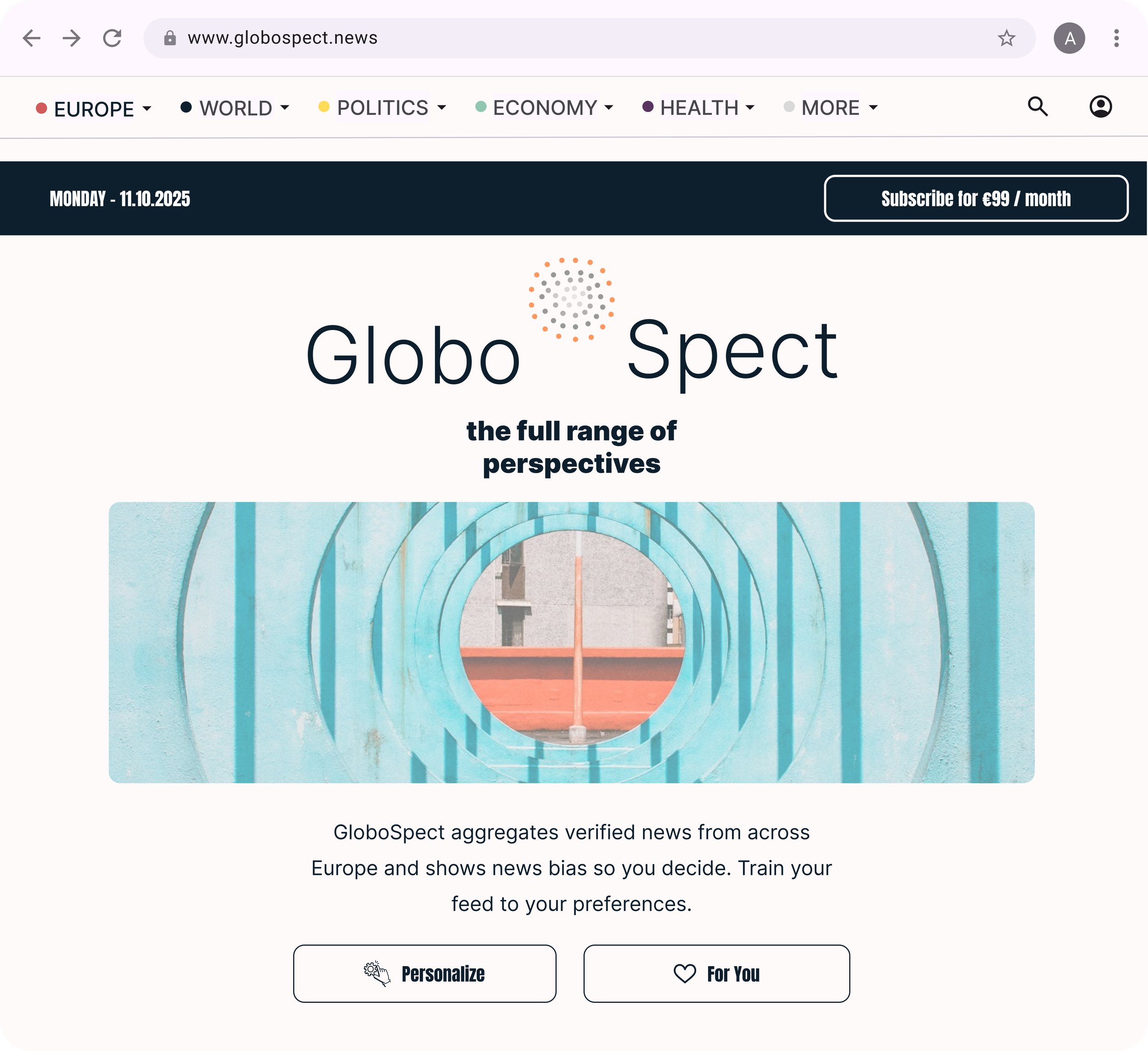
Web