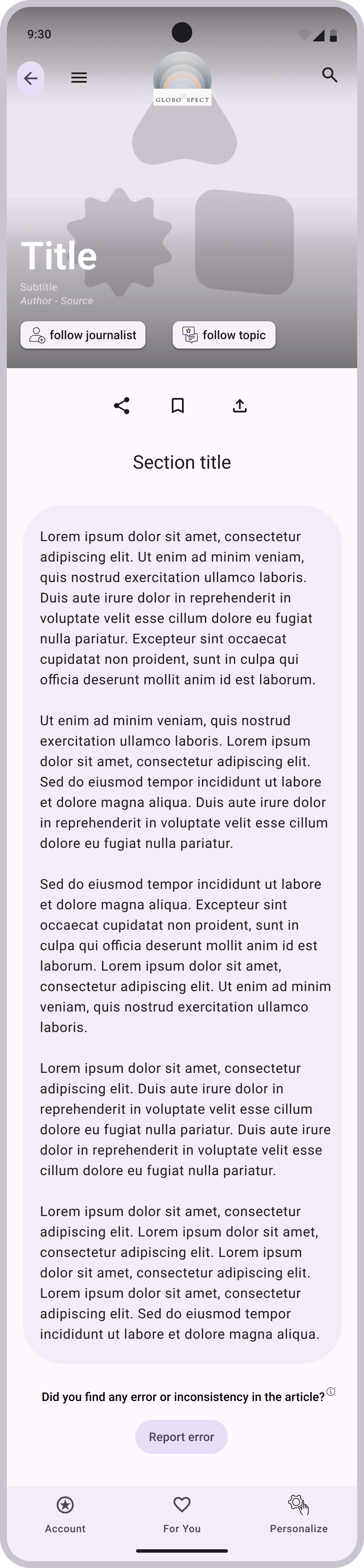
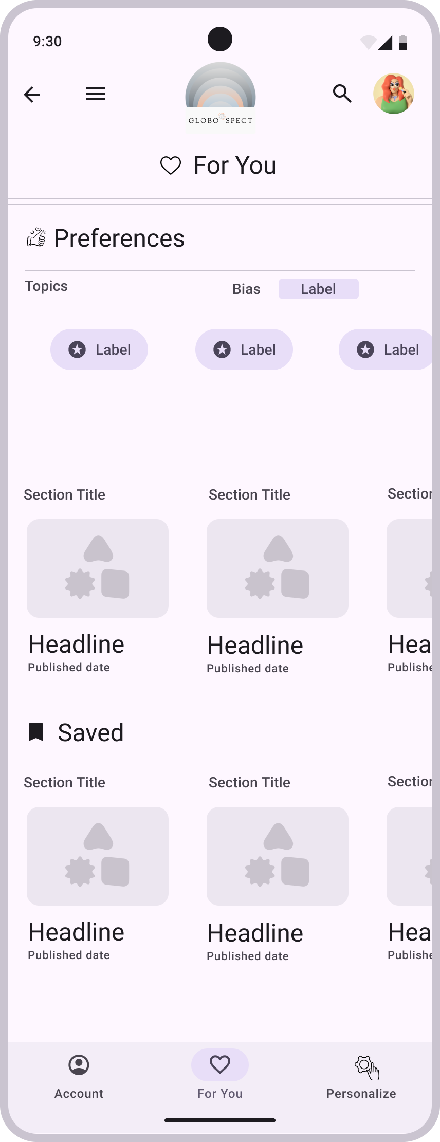
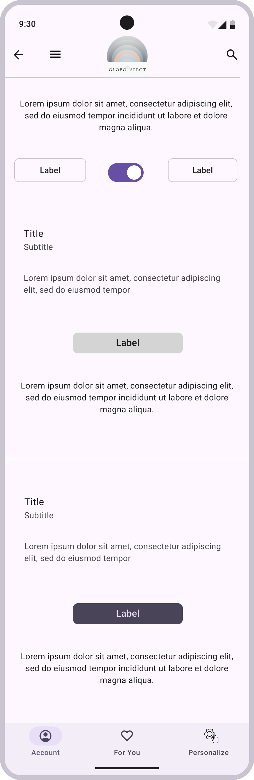
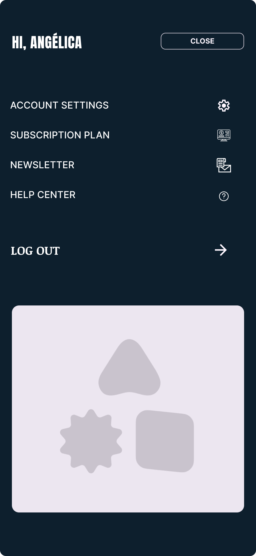
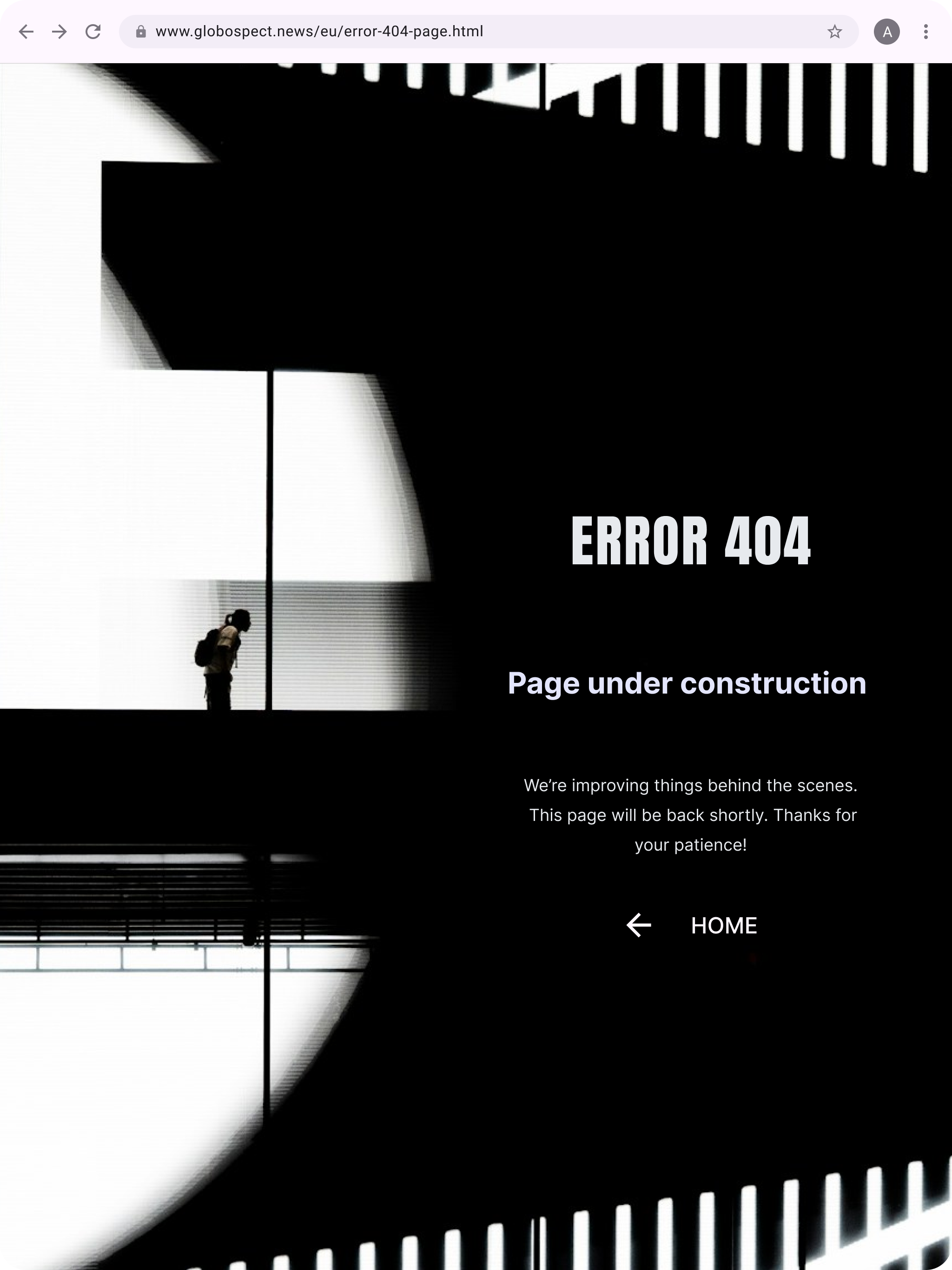
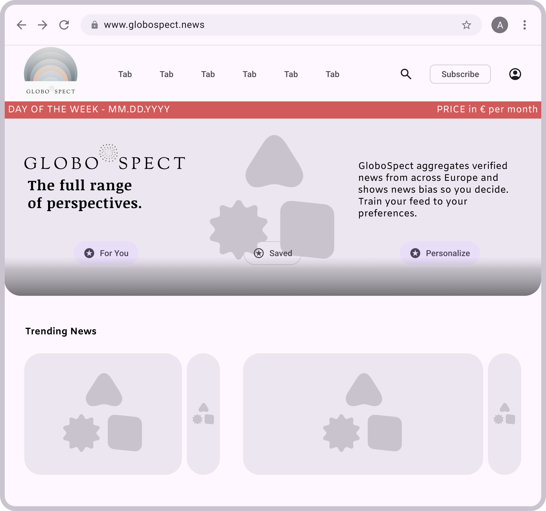
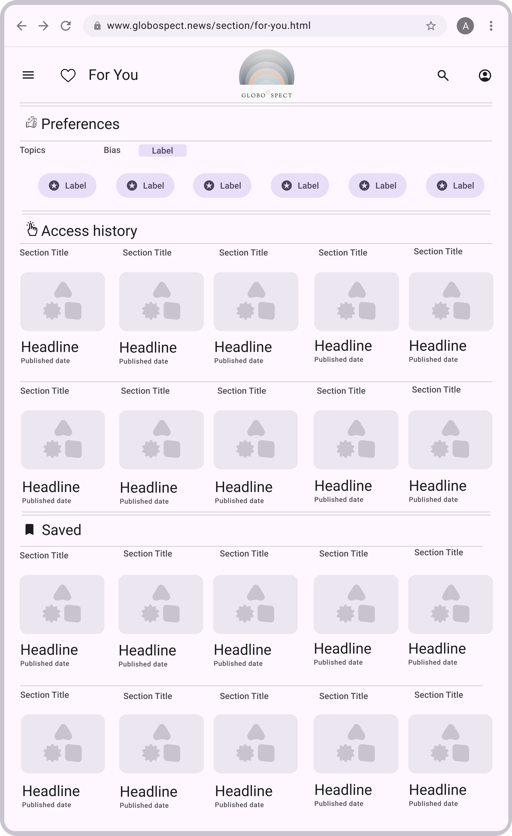
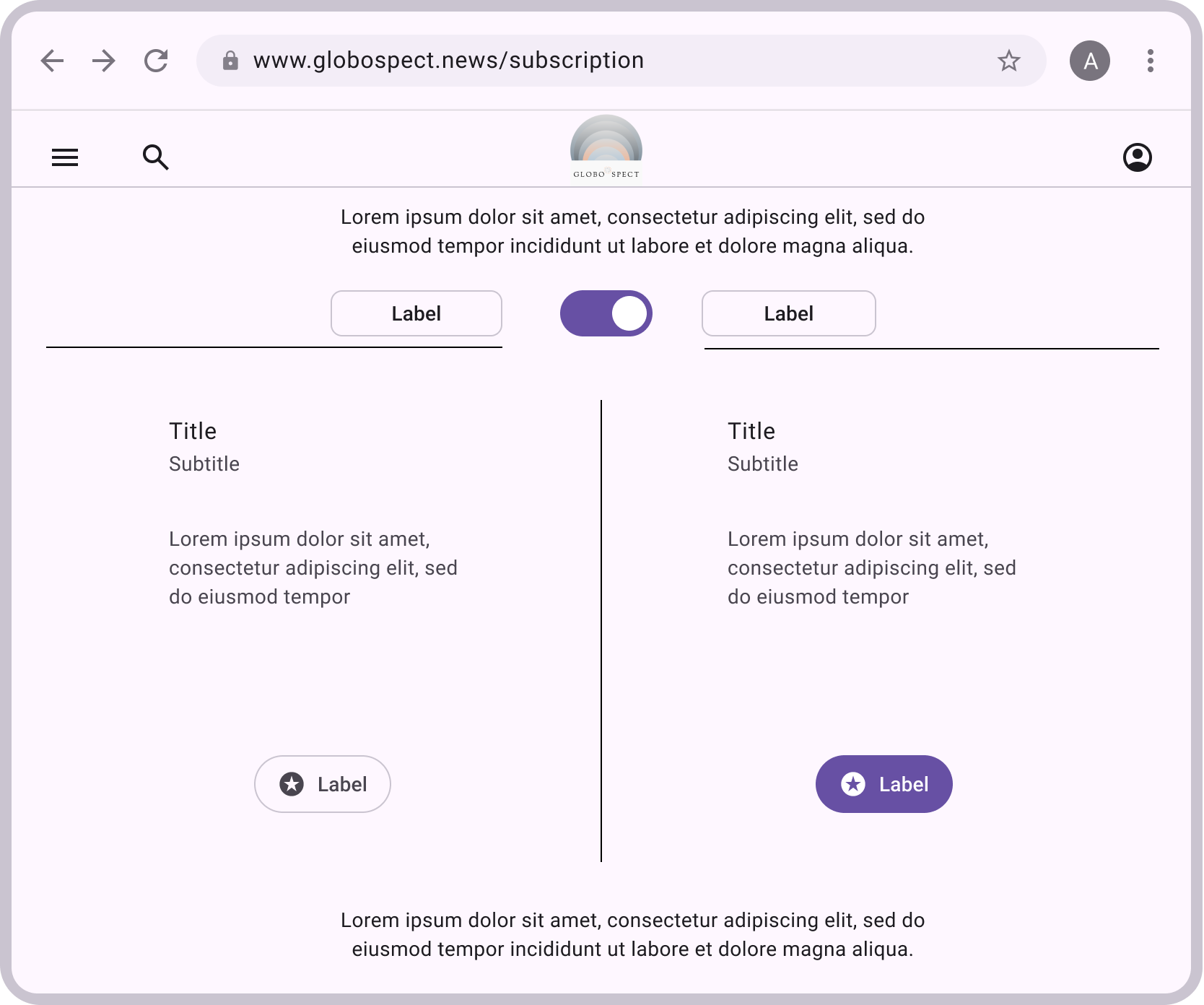
GloboSpect was conceived to address issues pointed in the UX research by offering news content aligned with the user’s preferred bias, combined with a clean, intuitive interface. The platform provides clear guidance on how to customize the experience and access key resources, such as saved items, while maintaining a modern, distinctive, and user‑centered design.Discover the color palette, plus the thoughtful typography, layout, and logo choices and the impacts they create. Every decision reflects creativity, research and real results.
Mobile

⋂ Web, Mobile & Tablet
hi-fi wireframe to prototype
Figma
Web
Tablet
⋂ Web & Tablet
Moodboard
Milanote

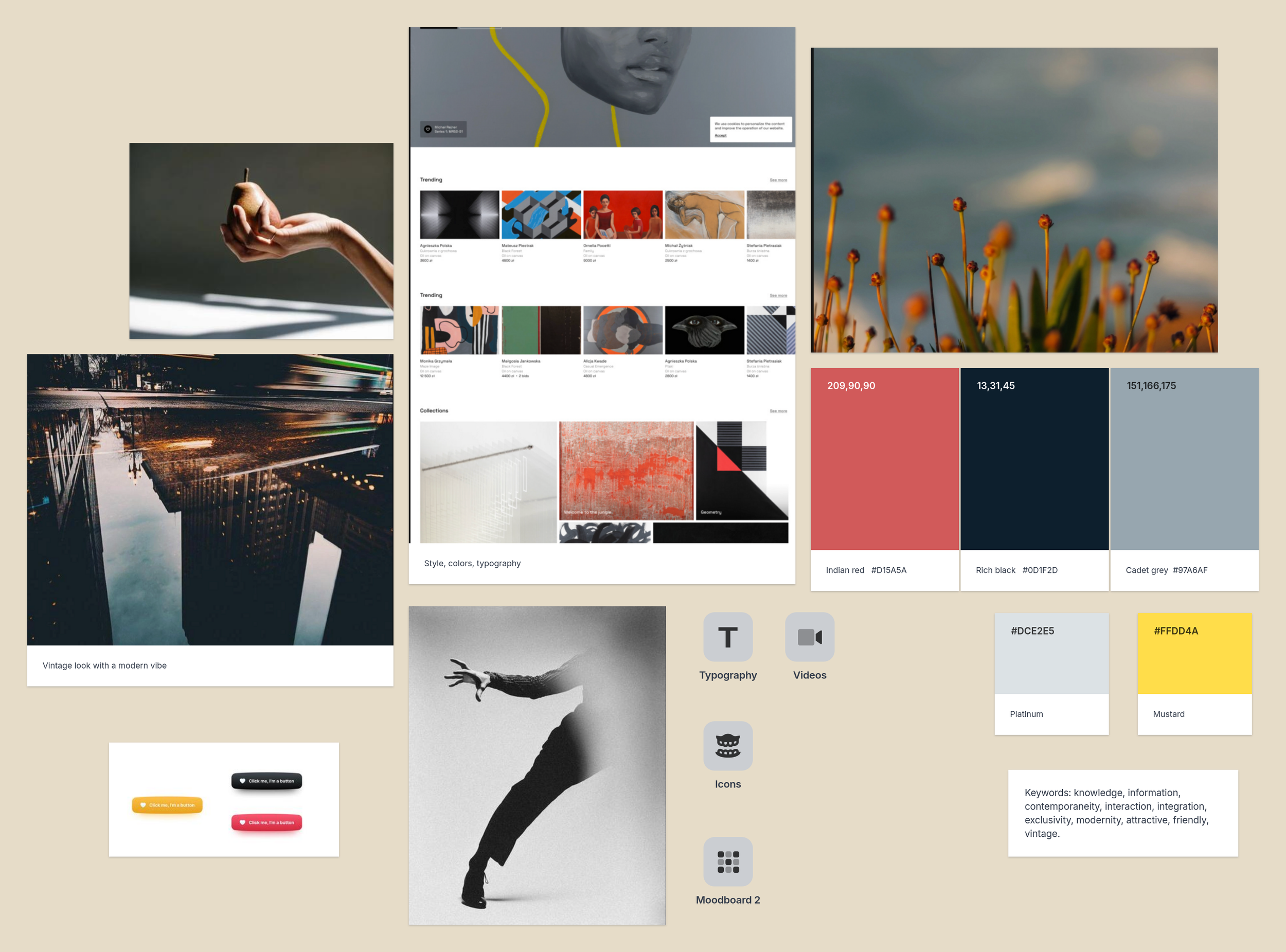
globospect
Logo
colors
tipography
The color palette, as we can see in the moodboard, was defined early in the process to establish a vintage tone without compromising usability. Together with the typography, it creates a cohesive and accessible visual identity. The logo’s layered composition reflects the range of perspectives users may encounter when engaging with the same topic.
Logo

Based on historical newspaper references, Indian red was selected as the primary color. The remaining palette was developed using color spectrum combinations, with an emphasis on neutral tones to prevent the news website from feeling visually overwhelming. These choices define the brand’s core colors. Neutral tones are also applied in more specific contexts, which will be demonstrated in the following sections.
The colors in this project were chosen to create a clean yet attractive interface.
Brand Colors
Background
RGB: 255, 250, 250
HEX: #FFFAFA
Opacity: 100%
Infographic
RGB: 245, 245, 245
HEX: #F5F5F5
Opacity: 100%
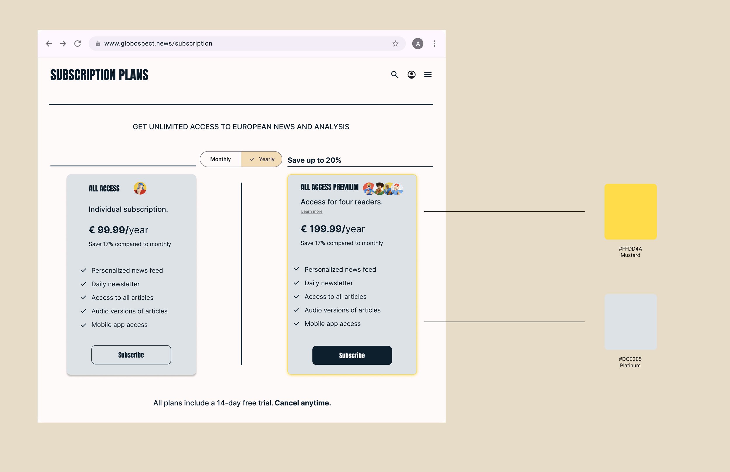
Platinum
RGB: 220, 226, 229
HEX: #DCE2E5
Opacity: 100%
Cadet grey
RGB: 151, 166, 175
HEX: #97A6AF
Opacity: 100%
Mustard
RGB: 255, 221, 74
HEX: #FFDD4A
Opacity: 100%
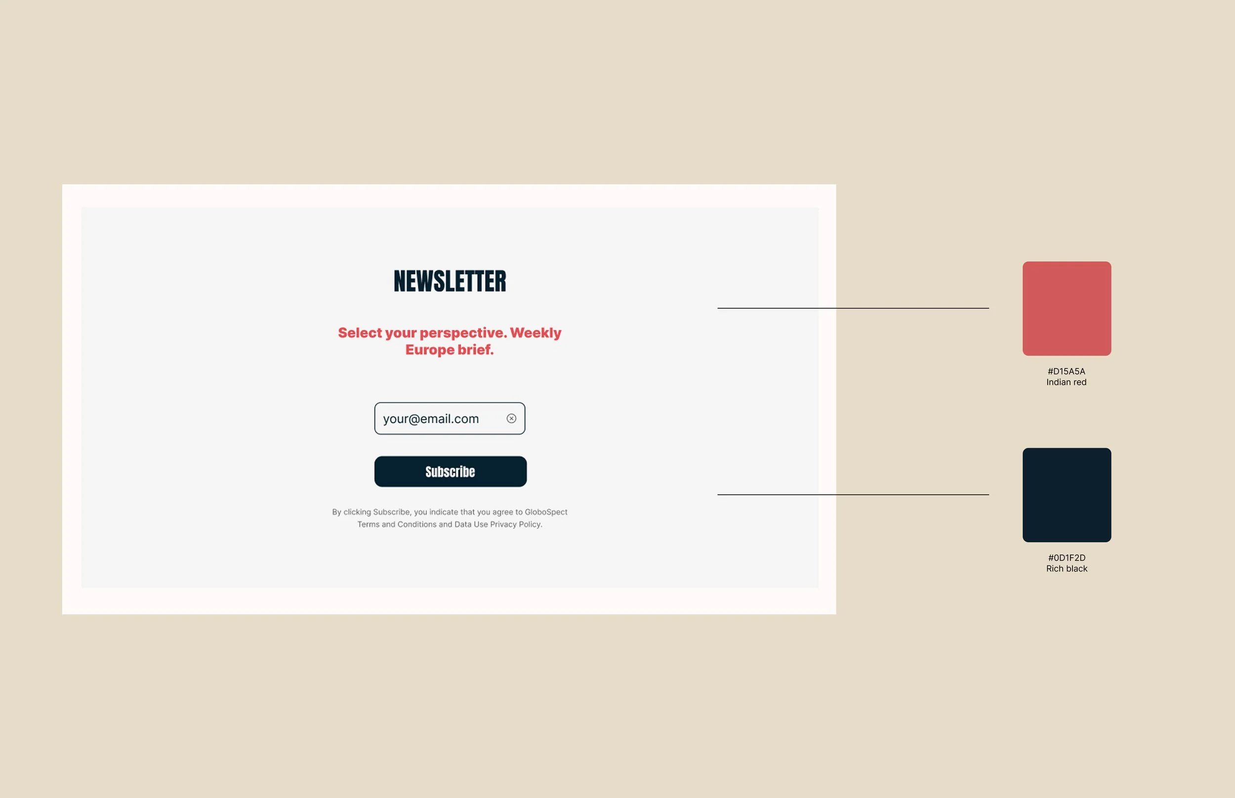
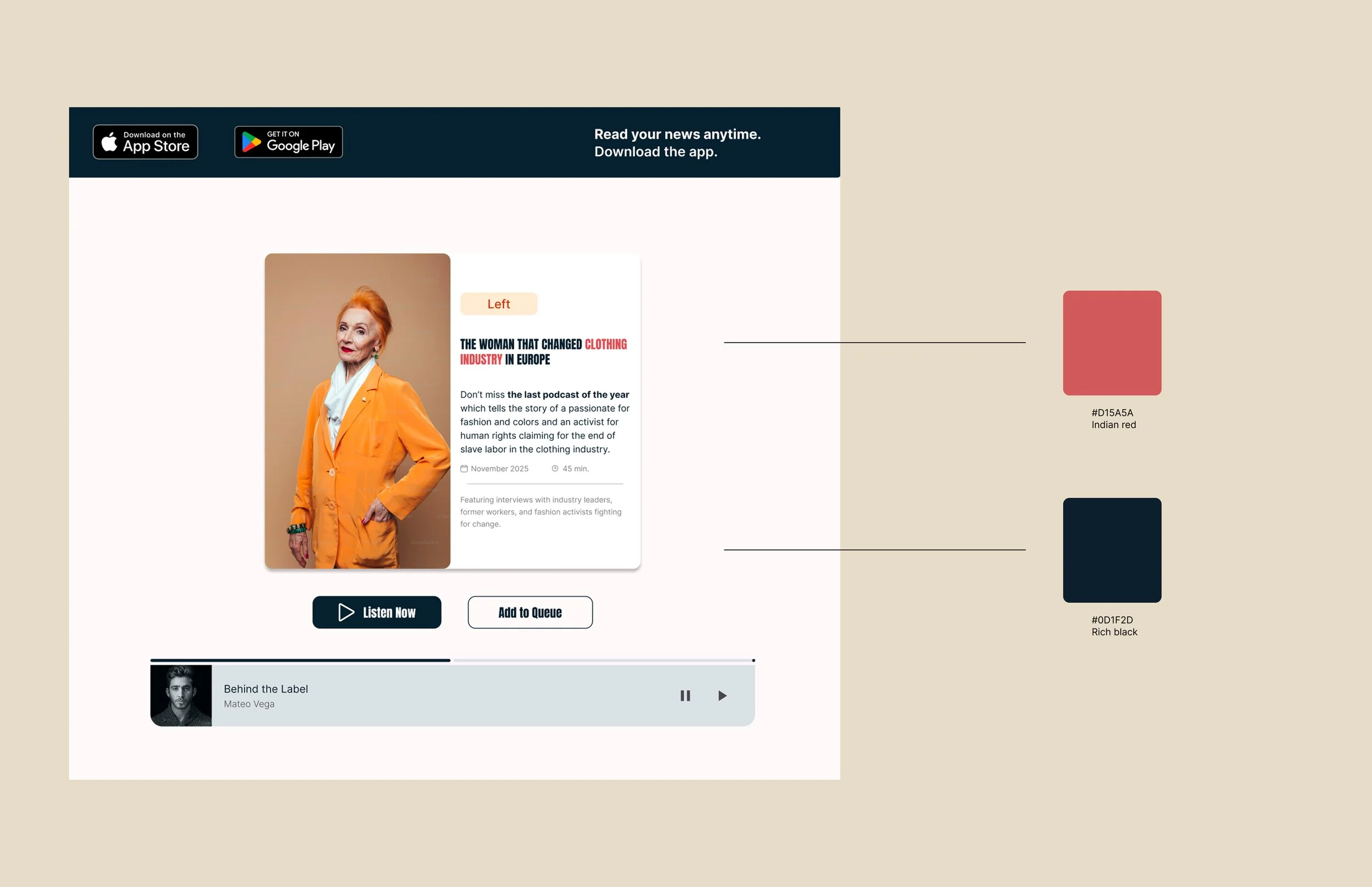
Indian red
RGB: 209, 90, 90
HEX: #D15A5A
Opacity: 100%
Rich black
RGB: 13, 31, 45
HEX: #0D1F2D
Opacity: 100%
Additionally, to highlight certain buttons in a more refined way, since the brand colors could impact the site’s visual accessibility or become overly repetitive, the colors Papayawhip and Burntorange were used as alternatives.
The use of pure white for the background and pure black was avoided; instead, variations of these colors were chosen to better harmonize with the rest of the brand palette. The "Background" color is used for white and "Rich black" is used instead of black.
Papayawhip
RGB: 255, 237, 213
HEX: #FFEDD5
Opacity: 100%
Burntorange
RGB: 194, 65, 12
HEX: #C2410C
Opacity: 100%

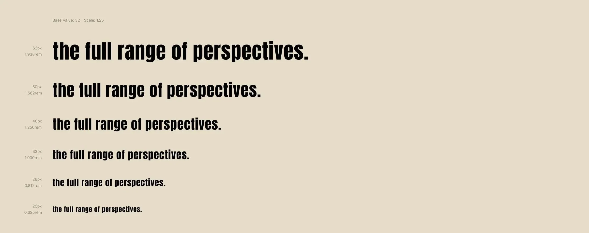
For typography
the choice of Anton for headings and highlights and Inter for body text and subtitles was based on their strong legibility and compatibility, giving the newspaper a modern feel without making it overly informal.
Inter
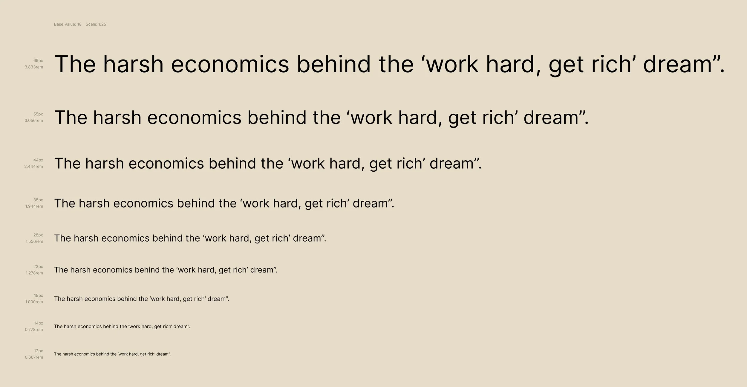
Anton